CFUI
Cloudflare-inspired React components, with familiar composition, light and dark themes, and plain CSS.
CFUI is an independent, open-source React library based on the visual language of Cloudflare's dashboard. It gives applications forms, navigation, overlays, tables and other dashboard controls through familiar shadcn-style component composition.
I initially built it for the Artifacts competition, then packaged the controls with Radix primitives, TypeScript declarations, scoped CSS and light and dark design tokens. Release tags include the built package and font assets, so developers can install it directly from GitHub. The project is unofficial and is not affiliated with Cloudflare.
Highlights
- 83 modules across 11 component families
- React composition and Radix primitives
- Plain CSS, themes and GitHub releases
In action
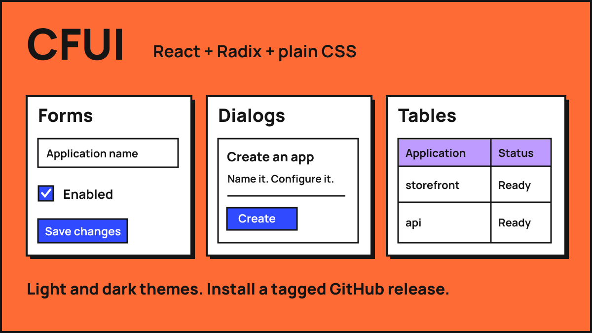
A familiar dashboard vocabulary
I initially built CFUI for the Artifacts competition. Developer tools often need the same small vocabulary: a form, a table, a status, a menu and a dialog. CFUI takes the visual language of Cloudflare's dashboard and makes those pieces available as a React package. It is useful when a tool should feel at home in that kind of working interface without recreating each control from scratch.
The library contains 83 modules in 11 families, including actions, fields, selection, navigation, data and messaging. That count includes providers, hooks and stores as well as visible components. The inventory names every module and separates observed dashboard references from components adapted from the same design foundation.
Compose the interface
The API follows familiar shadcn-style composition. A dialog is assembled from its trigger, content, header, description and actions; a form still uses native inputs and form behaviour. Radix primitives provide the foundations for interactions such as focus management, dismissal and returning focus to a trigger.
Native props, forwarded refs and short module imports keep the controls usable inside an existing application. More specialised pieces use established libraries for tables, charts, dates and forms. Focused tests cover behaviours such as sidebar composition, table page sizes, notifications and overlays, alongside checks of the packaged build.
Ship the styles with the package
CFUI uses scoped classes and plain CSS rather than requiring a Tailwind setup. Design tokens cover colour, typography, borders and radii, with light and dark palettes and a locally served Inter font. A document-level theme reaches menus and dialogs rendered outside the main application container.
Tagged GitHub releases include JavaScript, TypeScript declarations, the stylesheet and font assets. Installing a release does not require running the library's build scripts. Developers can use the package root or component subpaths, and pin a tag or commit when an application needs a reproducible dependency.
Make the boundaries legible
The public repository includes a component gallery and an explicit coverage inventory. These show both the design foundation and where it has been extended. The library does not promise identical behaviour or appearance across every Cloudflare or shadcn screen, and its directional drawer uses dialog behaviour rather than a gesture engine.
CFUI is an independent MIT-licensed project. It sits alongside EnoughUI as another interface library in my work, with its own dashboard-oriented design language and React package scope. The useful part is the reusable implementation: building blocks, documented composition and a release that another application can actually consume.