EnoughUI
A neobrutalist component library for web and Apple apps.
EnoughUI supplies the forms, navigation, tables, charts, dialogs, and other building blocks behind the Enough tools. Strong typography, square edges, and a shared palette give its React, Astro, and SwiftUI components a recognisable design language.
Try working examples in the public catalogue, inspect their source, and adapt the colours and typography to your own product. Web packages are published on npm; native Apple components are available as a Swift package.
Highlights
- React, Astro, and SwiftUI components
- Working examples with source
- Shared colours, typography, and design tokens
In action

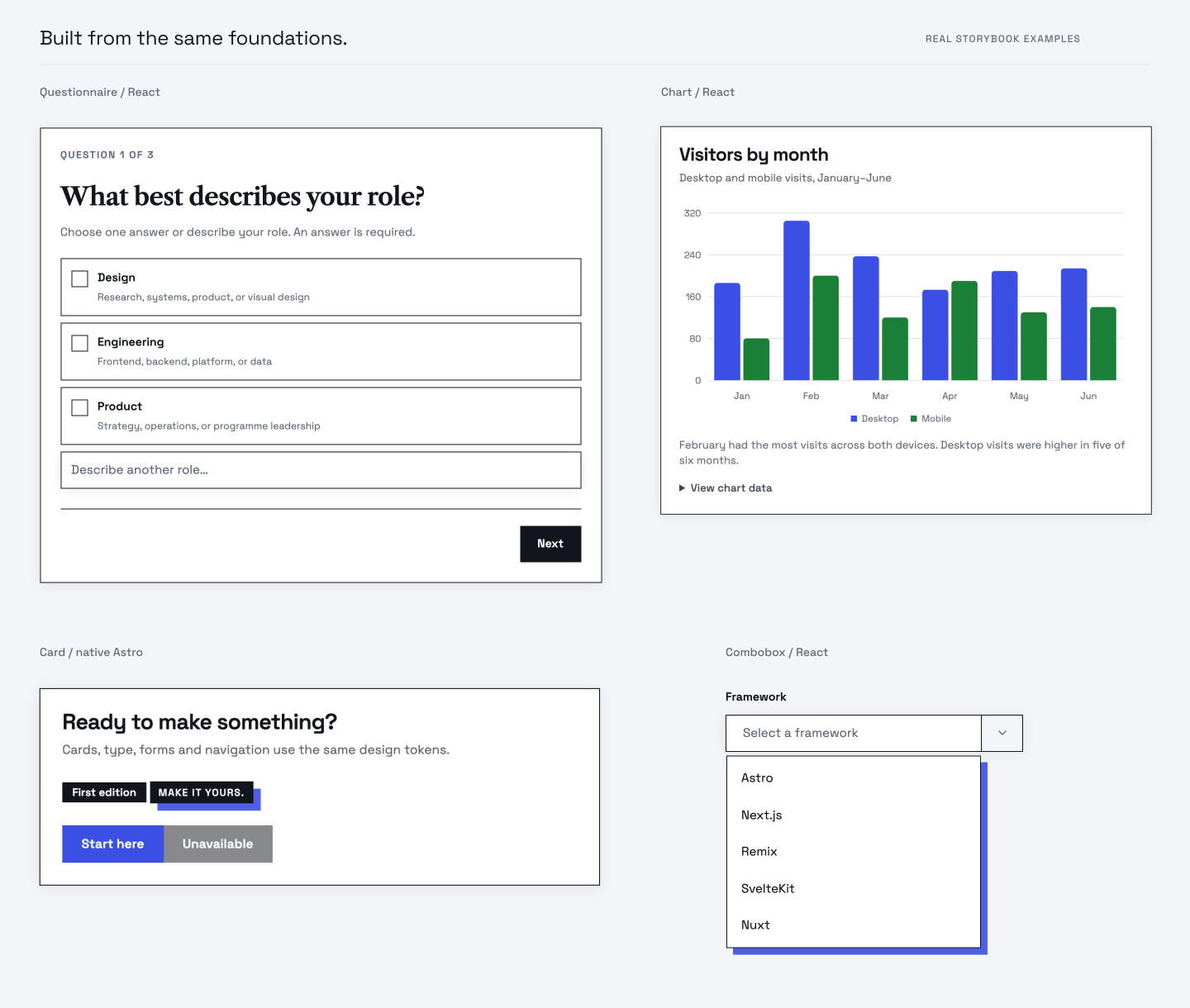
One design language, three ways to build
A static page and an interactive application need different amounts of machinery. EnoughUI’s Astro components render ordinary HTML without requiring React. A card, a table, or a labelled form can stay native to Astro; a stateful control can become a small React island where it is needed. React applications use the same interactive component implementation.
SwiftUI takes the design foundations into native Mac, iPhone, and iPad apps. It shares the palette and tokens while keeping a native component API and familiar Apple control behaviour. The aim is a recognisable family across products, with each platform retaining the way people expect to use it.
Examples you can actually build from
The public catalogue is a working reference. Search for a component, choose an example, switch between React and Astro, inspect the source, and preview a narrower screen. Its tiles are captures of real stories, and the live examples come from the same Storybook fixtures used in rendering checks.
That connection matters when moving from discovery to implementation. The example being browsed is also a concrete component composition that can be inspected and exercised. The Swift gallery provides native captures alongside Swift examples, so the Apple library has its own reference rather than borrowing web screenshots.
The design has to survive the interaction
A dialog needs to return keyboard focus. A form needs labels and useful errors. A long title needs to fit a narrow screen. EnoughUI’s verification includes interaction, rendering, accessibility, and package-consumer checks, with documented differences between renderers. A matching component name alone is not treated as proof that the behaviour is equivalent.
The visual foundation is neobrutalist: clear type, square edges, a shared palette, and visible hierarchy. Those choices belong alongside usable focus indicators, disabled states, and reduced-motion behaviour. The tests establish the scenarios they exercise; they do not claim every possible composition has been verified.
Bring the controls. Keep your product’s decisions.
EnoughUI provides components and styling, while the consuming application supplies its navigation, destinations, actions, and data. Colours and typography can be changed through design tokens. The published web packages include compiled styles, so an application does not need its own Tailwind setup just to use the library.
The React and Astro packages are available on npm, and the Swift library is installed through Swift Package Manager. All are MIT licensed. You can start with one useful control, assemble a complete interface, or inspect and adapt the source as the product develops.
Related writing

Frontend Three-Layer Architecture
Applying controller-service-repository thinking to React: view models, state management as a data-access layer, and why feature isolation is a lie.
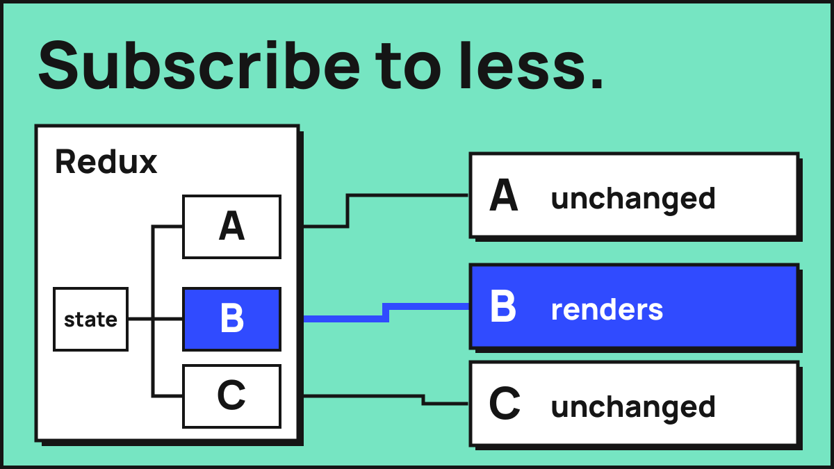
Fixing a Slow React App
Fixing a slow React app: why memoization is a bandaid, how Redux selectors and a whole workspace in memory caused it, and what actually worked.